Suggestion - Add back the old GUI

Benjamin Calicovane

Notorious Pirate
Prior to the Lost Weapons update in 2010, the game had a different hotbar GUI located in the bottom right hand corner. Here's a comparison of the 2 GUI's.

nfKfBM0.jpg


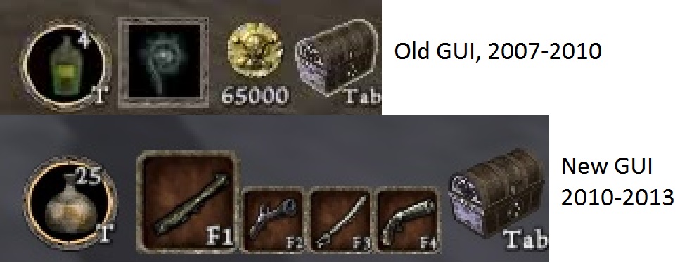
Personally, I like the old hotbar GUI better. I find only having 1 weapon, your gold amount, tonics, and your Sea Chest being displayed is cleaner and looks nicer than having 4 weapon slots, tonics, and the Sea Chest.
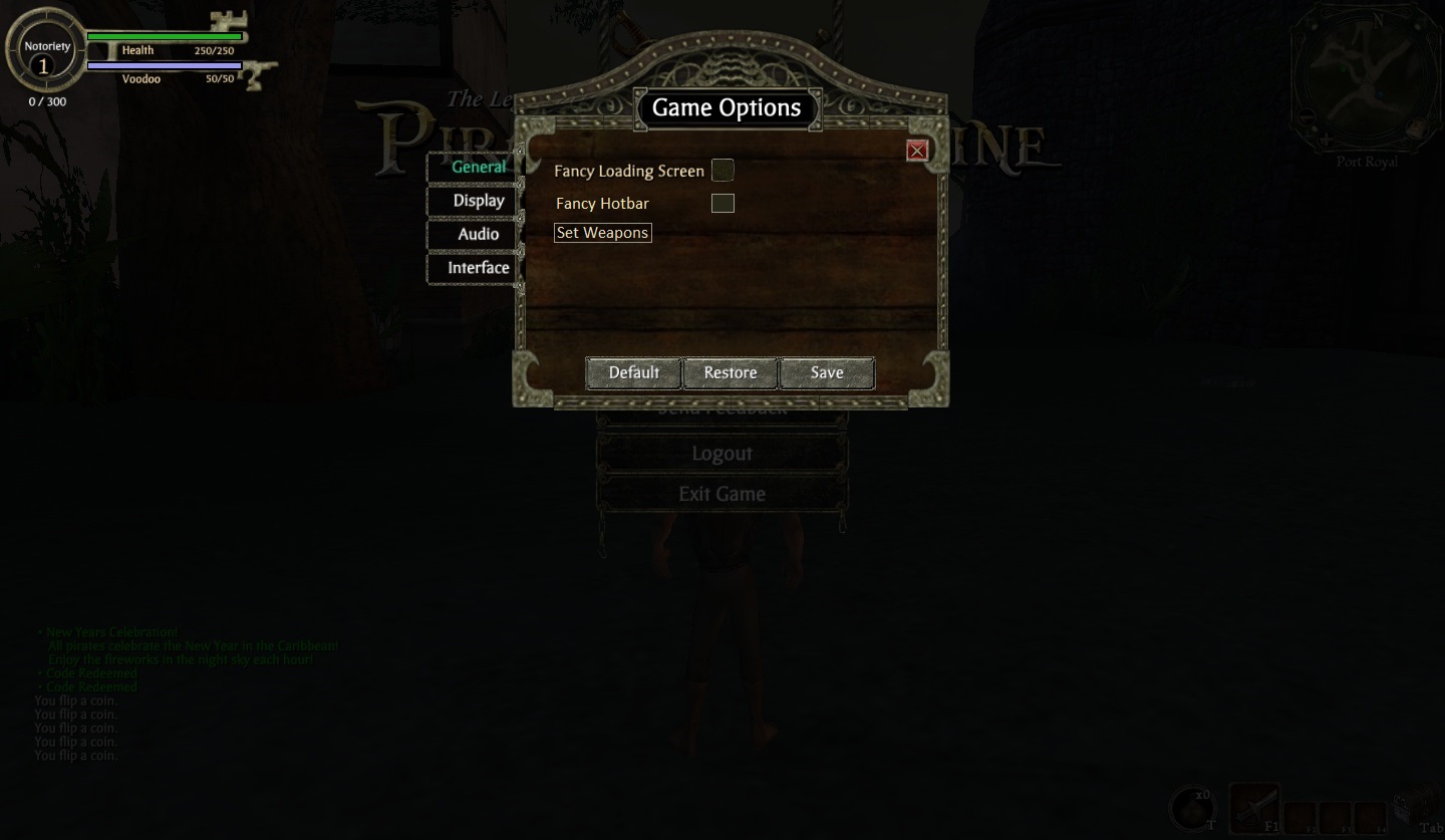
So here's my idea. You could go into the General tab, and there would be a button that says "Fancy Hotbar" (the word hotbar could be changed later if needed, it was the best word I could some up with for now). It would automatically be checked, but unchecking it would give you the old style hotbar.

PaYqUPf.jpg


However, now there's a problem! When the old hotbar was in the game, a pirate could only have 1 of each type of weapon at a time. You could press the buttons F1 through F6 in order to draw all your weapons (in the order sword, gun, doll, dagger, grenade, staff.) So here's my solution for this. After you uncheck the Fancy Hotbar option, a clickable button comes up that says "Set Weapons." If you click on it, you will be taken out of the F7 menu and into your weapons inventory. An additional GUI will appear to the left of your inventory.

Fb4ImmF.jpg


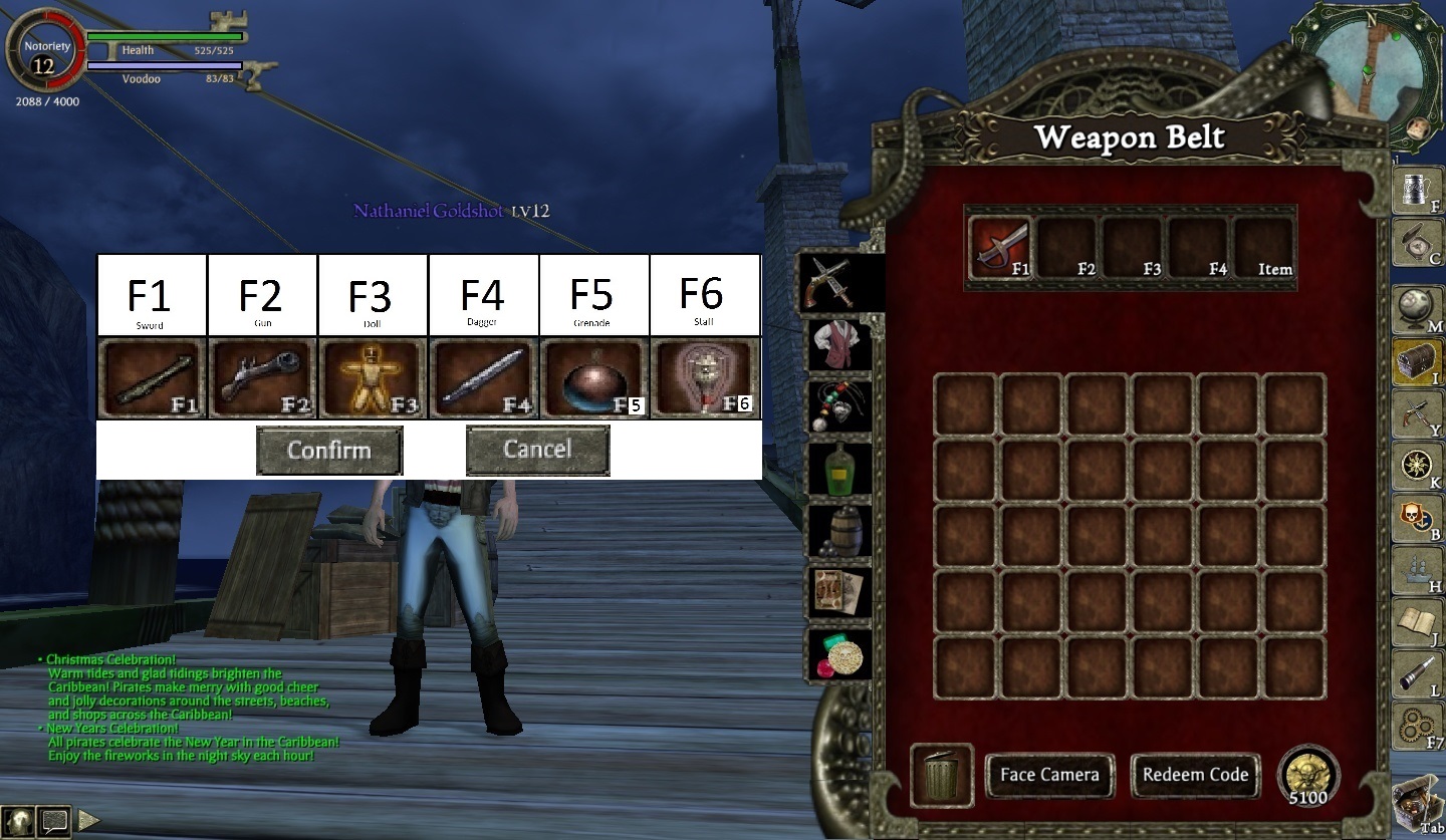
You can then proceed to drag weapons of your choosing into the appropriate slots. Once you are satisfied with your selections, you can click confirm. It would take you back to the menu, where you could then exit out and have the old GUI (a restart of the game may be required, not sure.) Clicking cancel would just take you back to the menu without changing anything.

Well, that's my suggestion. I think it would be neat to see this added in TLOPO, and considering the devs have already added the old loading screen and old body types, it shows they're willing to implement old features into the game as well as new ones. If you like the suggestion be sure to let me know. If there's anything you think could be changed to make it better, leave a comment and I'll read it!
 
This would be great to have an option to revert to the hold HUD.

I'd imagine it wouldn't take long to do, but if it takes a while and it hinders the development I'd just rather them work on the core game instead.
 
I don't think it will and nor do I think it should. There's plenty of things TLOPO has to do having been on it myself and this is something that's rather small in comparison to what needs to be done and finished.
 
Seems a little unnecessary and clunky... But that is coming from someone who started playing POTCO after the UI updates.

If they are going to go to the trouble of that they should just make a totally customizable UI system which the player can move UI elements around on the screen to fit their liking with certain styles they could choose from. Would be a lot more work, but would be a more complete option than having this clunky (what it seems like to me) system you propose.
 
I do like having the gold displayed on screen. As for the rest I'm fine with whatever happens, but I do like the original GUI and this idea in general. As for weapon switching, that may be over complicated, but that's what suggestions are for: to create and improve ideas!
 
Personally I prefer the new "fancy" bar simply because it takes too much time to go into the chest to change weapons. Having your 4 favorites immediately handy at the bottom of the screen is much more convenient when in the heat of battle. That being said, I gave Benjamin Calicovane's post a like mainly for all the work he obviously put into the graphics and detail in his post. Well done mate! :cheers:

I think his suggestion is fine to give the player the option to choose which they prefer if it is not too cumbersome for the devs or the game. I also agree with others that there are more important game aspects to be dealt with before something like this is considered.

Ah the memories

Stardom your signature gif keeps cracking me up! :p
 
Last edited by a moderator:
Personally I prefer the new "fancy" bar simply because it takes too much time to go into the chest to change weapons. Having your 4 favorites immediately handy at the bottom of the screen is much more convenient when in the heat of battle. That being said, I gave Benjamin Calicovane's post a like mainly for all the work he obviously put into the graphics and detail in his post. Well done mate! :cheers:

I think his suggestion is fine to give the player the option to choose which they prefer if it is not too cumbersome for the devs or the game. I also agree with others that there are more important game aspects to be dealt with before something like this is considered.


Stardom your signature gif keeps cracking me up! :p
I do see the perks of being able to have 4 of your favorite weapons readily available! However, I noticed you mentioned about having to go into the sea chest to change weapons. There were actually two more ways to do this; you could either press the F1 through F6 buttons (1 was sword, 2 was gun, 3 was doll, 4 was dagger, 5 was grenades, and 6 was staff), or you could use the scroll wheel to cycle through the weapons.

That's the beauty with this suggestion, though. You aren't forced to use one way or the other, the choice of which GUI you'd like to use would be competely up to you :)
 
Personally I prefer the new "fancy" bar simply because it takes too much time to go into the chest to change weapons. Having your 4 favorites immediately handy at the bottom of the screen is much more convenient when in the heat of battle. That being said, I gave Benjamin Calicovane's post a like mainly for all the work he obviously put into the graphics and detail in his post. Well done mate! :cheers:

I think his suggestion is fine to give the player the option to choose which they prefer if it is not too cumbersome for the devs or the game. I also agree with others that there are more important game aspects to be dealt with before something like this is considered.


Stardom your signature gif keeps cracking me up! :p
I always used the f1-f4 to get my weapons up fast, I would switch back and forth super fast that way while battling a boss. I would hate to have to use my mouse to click on the boxes instead.
 
I always used the f1-f4 to get my weapons up fast, I would switch back and forth super fast that way while battling a boss. I would hate to have to use my mouse to click on the boxes instead.
with the old system it was f1-f6 and you only had one weapon of each type. You needed to do quests to get more weapons.. Once you got the new one you could not go back to the old one.
 
Since they seem to be added old items to the game (old loading screen and old skies!), maybe they will add an option for this
It could be a future option but at no point should it be a priority. There's so much to be done, and Old vs New GUIs are just aesthetics and slight difference in convenient functionality. I'd have no problem with it but now is not the time to really look into it.
 
It could be a future option but at no point should it be a priority. There's so much to be done, and Old vs New GUIs are just aesthetics and slight difference in convenient functionality. I'd have no problem with it but now is not the time to really look into it.
I hope they keep it the way it was when the game closed, I liked it when I could switch weapons fast using my keyboard instead of clicking a mouse.
 
I hope they keep it the way it was when the game closed, I liked it when I could switch weapons fast using my keyboard instead of clicking a mouse.
The old system allowed for keyboard switching as well, by pressing F1-F6. I've actually never used the new system aside from Alpha, but there's no weapons to test it with right now.
 
Back
Top